CONTEXT

Música UNAM came to us with a choral challenge. As the music division of the largest public university in the Americas, it is home to multiple voices: the Philharmonic Orchestra (OFUNAM), the Eduardo Mata Youth Orchestra, the Academy of Ancient Music, and several experimental programmes. Each has its own personality, but all are under the same institutional umbrella.

The challenge was both fascinating and delicate. How to create visual harmony while highlighting the unique characteristics of each ensemble? We worked directly with the Música UNAM team to understand not only what they do, but why they do it: to bring transformative musical experiences to both the university community and Mexican society.

What we discovered excited us: they needed a contemporary and fresh visual identity that would invite new audiences while honouring decades of tradition and musical excellence. In other words, to connect emotionally with very diverse audiences, from 20-year-old students to 60-year-old music lovers.

SERVICES

Strategy
Branding
Digital

INDUSTRIES

Education
Social Impact
Culture

“xxxxx”

— xx

CHALLENGE

How do you unify a musical identity that draws students into concert halls without compromising artistic integrity?

The briefing presented us with an interesting challenge. UNAM needed a system that would work for classical orchestras, experimental sound laboratories, the early music academy, and various educational programmes. It wasn’t just about creating visual cohesion.

It was about building cultural bridges without losing the essence or resorting to a superficial pop approach. How do you make a 22-year-old engineering student feel welcome at a contemporary music concert? How do you leverage the academic rigour that characterises UNAM to attract new audiences?

That’s when we discovered our real challenge: to create a visual language that would genuinely integrate with university life, using musical tradition as a bridge to new audiences, not as a barrier.

In our conversations with the Música UNAM team, a key question emerged: could we turn the tension between musical tradition and contemporary visual language into a creative force that would guide the identity of Música UNAM? The answer became the heart of all our work.

Música UNAM - 1

01.

A Flexible Brand Architecture

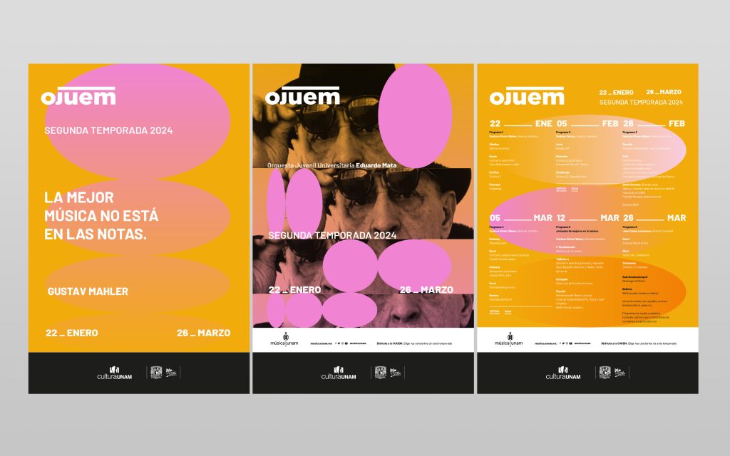
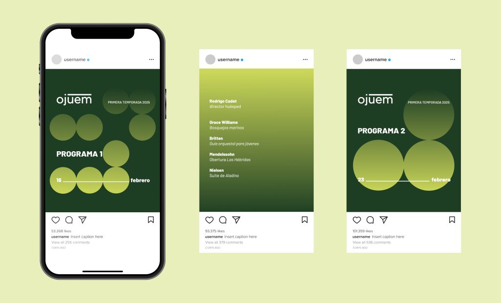
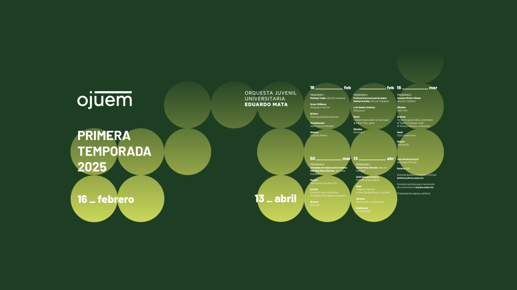
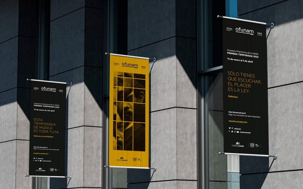
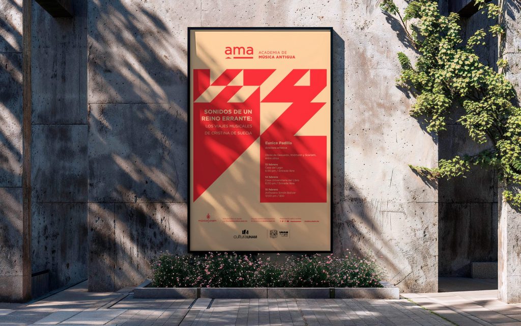
We designed Música UNAM as the central brand, with specific identities for each entity: OFUNAM, OJUEM, AMA, Chamber Music, and special projects such as the Piano Festival, Sound Laboratory, and educational activities.

In our co-creation sessions with Música UNAM, we discovered something important: each ensemble needed to maintain its unique personality while being part of the larger ecosystem. As the team explained to us, the Youth Orchestra could not feel the same as the Academy of Ancient Music, but they should recognise themselves as part of the same family.

The solution was to create a modular structure that celebrates diversity. Each entity retains its distinctive character while contributing to a larger identity—like a symphony orchestra where each instrument maintains its unique voice while contributing to a choral expression that creates a shared and recognisable narrative.

02.

A Grid System Inspired by a Musical Revolution

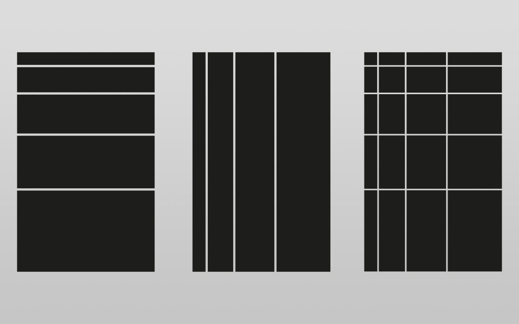
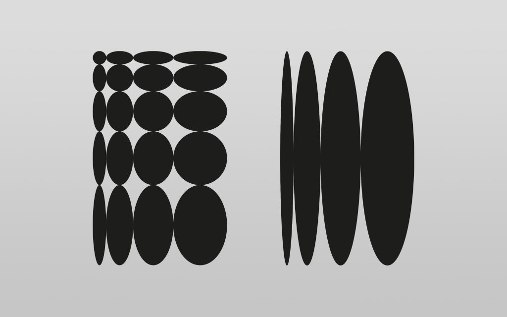
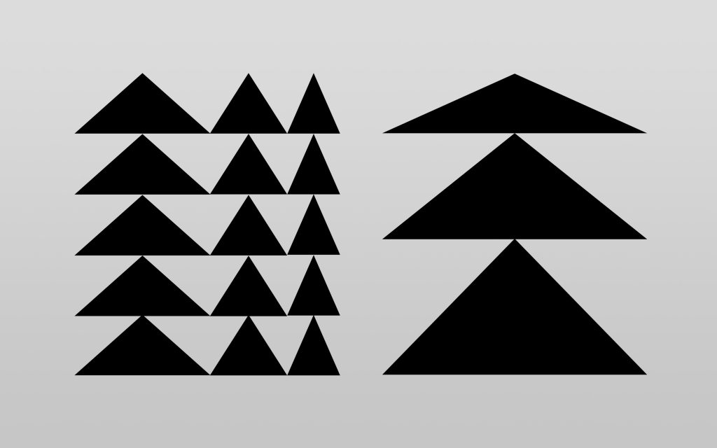
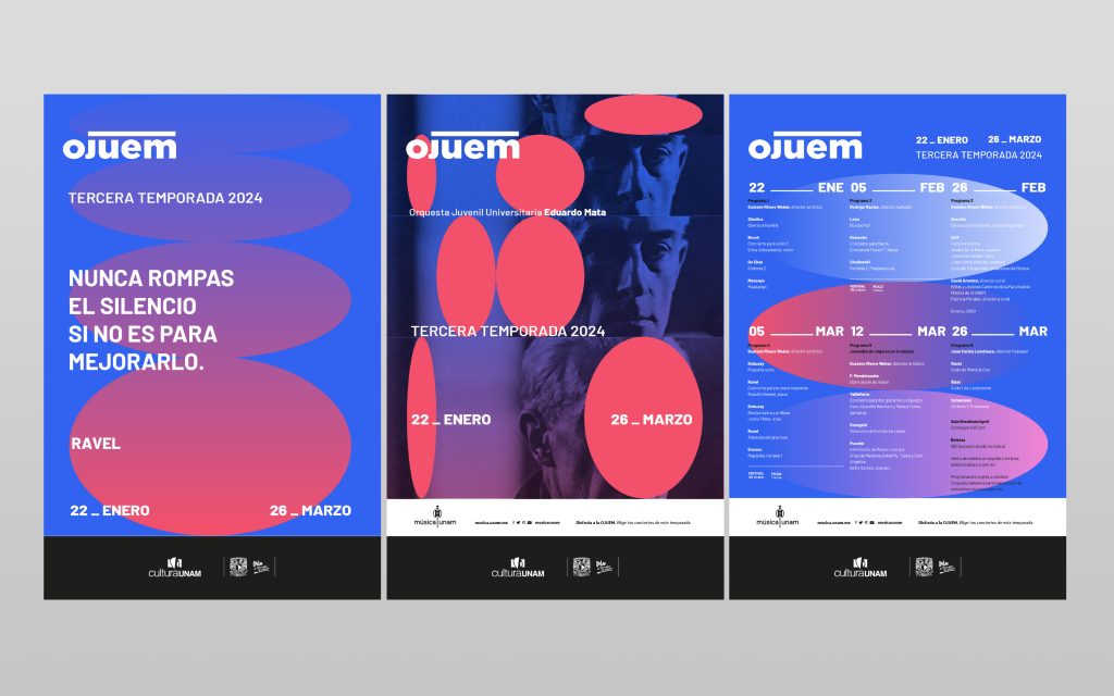
We designed a flexible visual system inspired by the musical revolution of the 20th and 21st centuries. We drew on composers who broke with traditional rules—from dodecaphonism, serialism, and minimalism—to create a structure that combined mathematical precision with creative freedom.

During our design process, the UNAM Music team helped us understand something key: many musicians think visually in terms of fragments, layers, and complex structures that coexist. This led us to create a visual language that used fractured elements and structured layers—like the scores they work with every day.

The result was a system that musicians understood instinctively and that connected with wider audiences. Each visual fragment echoes the musical compositions it represents, connecting visual abstraction with music in a way that is organic and recognisable to musicians and music lovers, and appealing and powerful to new audiences.

Música UNAM - 2
Música UNAM - 3
Música UNAM - 4
Música UNAM - 5
Música UNAM - 6
Música UNAM - 7

03.

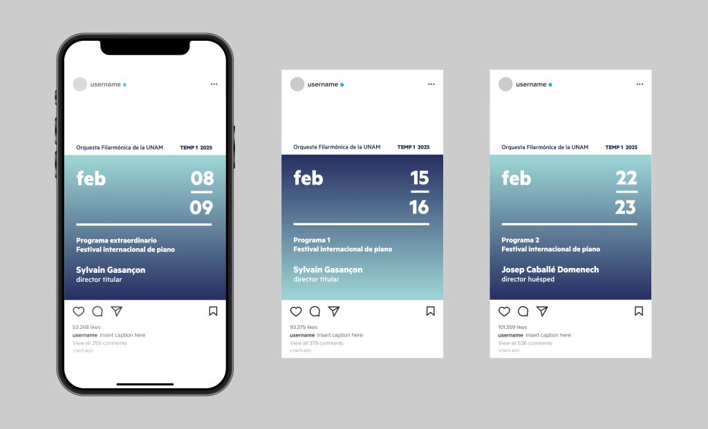
A Cohesive Colour Palette

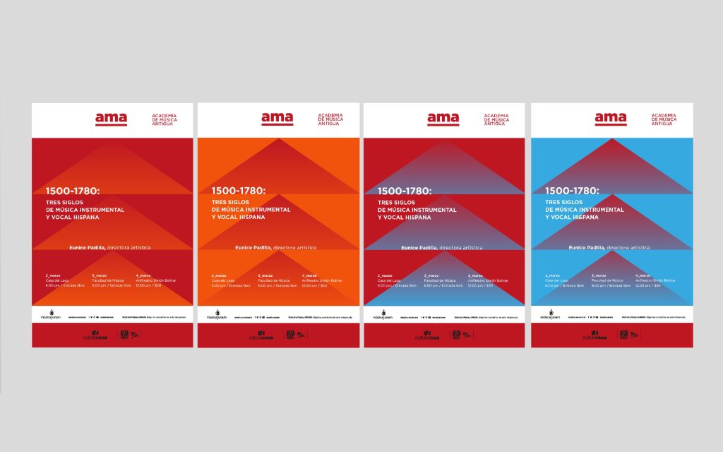
We developed a colour system that would create visual harmony between all the musical entities without standardising their personalities.

Like musical scales, our colour gradients in tonal layers conveyed depth, movement, emotional range, and the richness of the musical experience.

Música UNAM - 8
Música UNAM - 9
Música UNAM - 10

SOLUTION

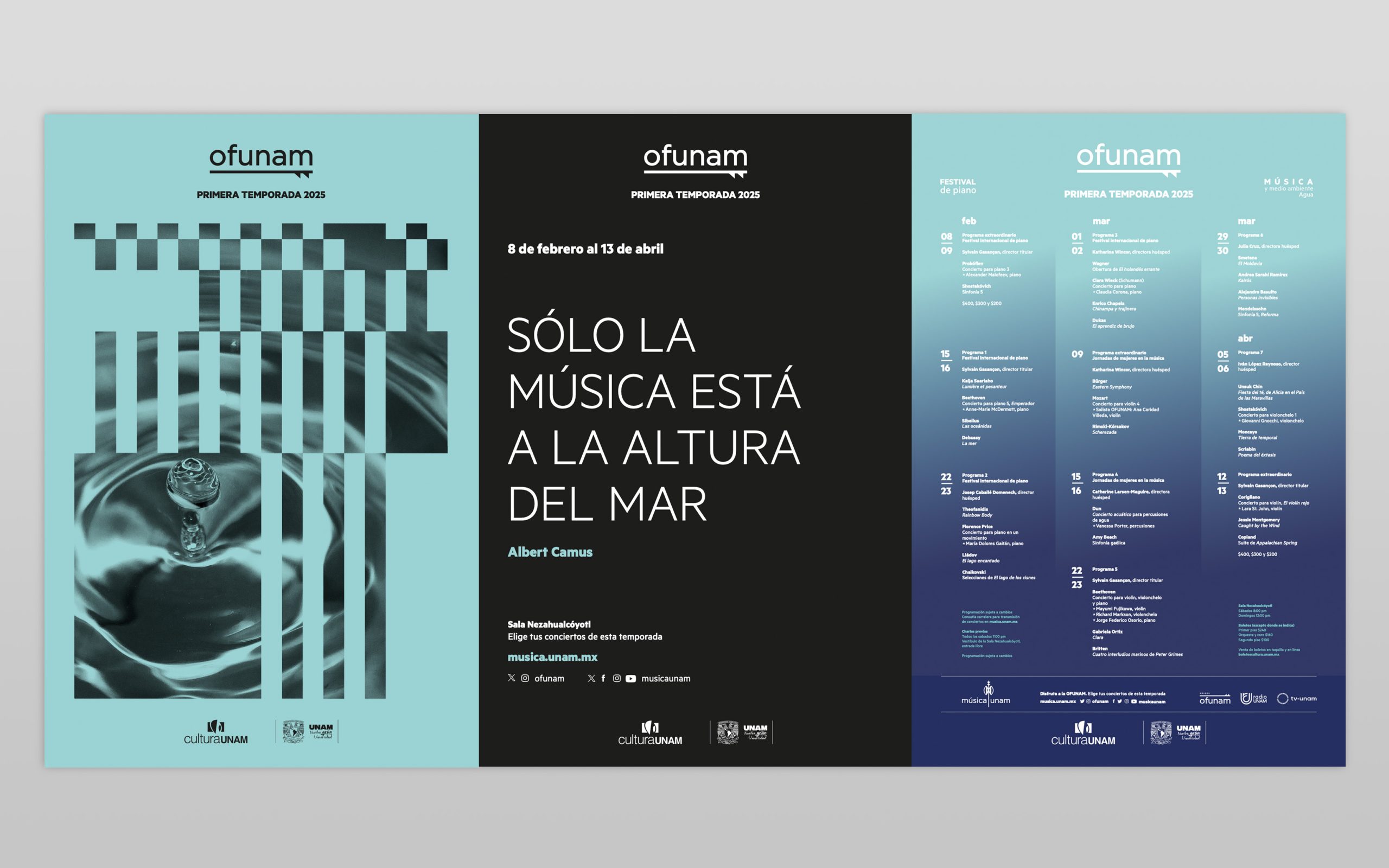
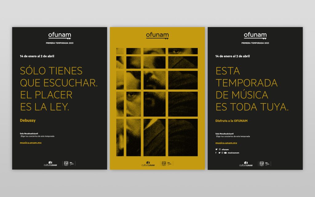
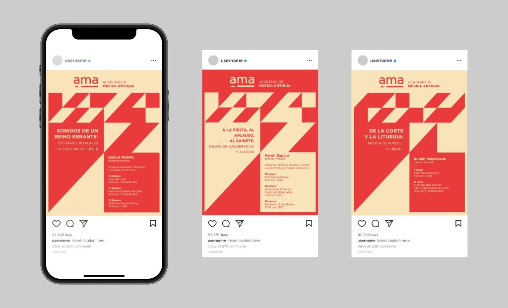
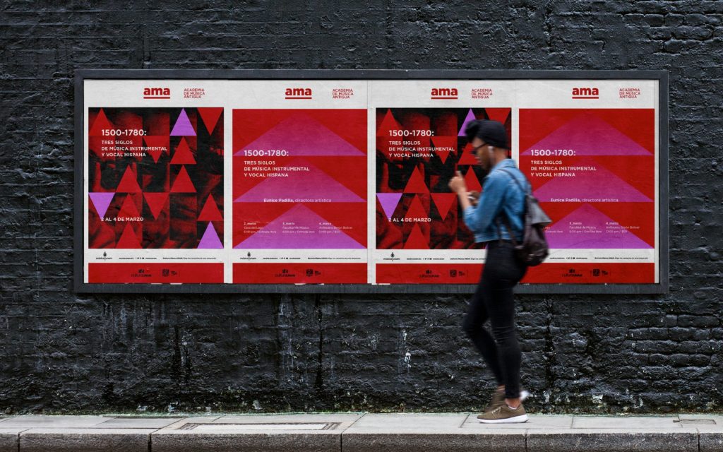
The new identity system brings together the various music programmes of Música UNAM under a contemporary visual language. We do this through fragmented images, geometric elements and quotes from classical composers that serve as a narrative connection supporting the brand identity.

The system communicates a clear brand purpose, connects with diverse audiences, promotes the unique expression of each ensemble while maintaining institutional cohesion, and works effectively in posters, programmes, and animations for digital media.

The brand now expresses itself in the creative tension between the structure and freedom of music, serving as a reflection of UNAM’s commitment to cultural accessibility and artistic excellence.

Música UNAM - 11
Música UNAM - 12
Música UNAM - 13
Música UNAM - 14
Música UNAM - 15

IMPACT

+ 0 Activities and events organised
+ 0 Million people reached through activities and events
+ 0 Música UNAM YouTube subscribers
+ 0 OFUNAM Instagram followers
+ 0 OJEM Instagram followers
+ 0 Million visits to musica.unam.mx

CREDITS

STRATEGY & CREATIVE DIRECTION
Gorka Meneses

VISUAL DESIGN
Fernanda Lhez
Malcolm Llanas

CLIENT LEAD
Jose Wolfer, General Director
Gaby Pelaez, Deputy Director of Programming
Edith Silva, Deputy Director of Dissemination and Public Relations

UNCODE.NETWORK
Boo Design Studio
SPORE

Let's start a conversation.

Ready to work together?