CONTEXT

RE!NSTITUTE came to us with a necessary transformation. Formerly known as Rapid Results Institute, this social impact organisation works in more than 28 countries on projects related to justice, homelessness, health, and human rights. Recognised for its 100-Day Challenges, it drives systemic change through short-term collaborative actions.

We were excited by the opportunity to work with a leading global NGO and help them transform their narrative and the way they organise their services and brand architecture to further increase their positive social impact. We were invited to lead a complete transformation: a new name, a new identity and a digital ecosystem that more accurately reflected their approach, partnerships and global reach.

The challenge was no small feat: the new brand had to resonate with a wide range of audiences, from judicial reformers in Latin America to funders in the United States and international organisations such as the World Bank and USAID.

SERVICES

Strategy
Branding
Digital

INDUSTRIES

Education
Social Impact

“They helped us see a much bigger, sexier, more exciting brand than we could have come up with on our own.”

— Echo Collins-Egan, former Chief Impact Officer at RE!NSTITUTE

CHALLENGE

How do you completely rebrand and reframe a global NGO without losing credibility or momentum?

Beyond the legal obligation to remove ‘Rapid Results’ from its name, RE!NSTITUTE needed a new identity that reflected its innovative and multi-sector mission. We had to create a system that would communicate effectively with radically different audiences.

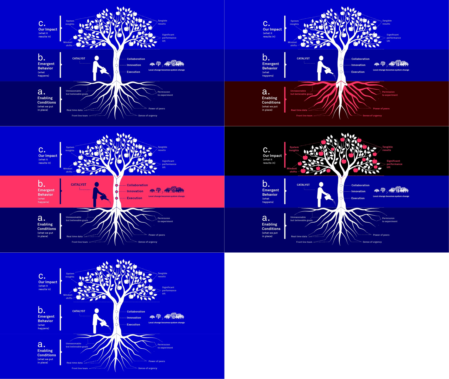
In our co-creation sessions with Echo Collins-Egan and the entire RE!NSTITUTE team, we discovered something transformative: the organisation’s real potential on the ground, its ability to generate measurable impact in just 100 days. That capacity for transformation became the cornerstone of the project’s entire conceptual, verbal and visual narrative.

There we understood the essence of our work: to create a clear, adaptable and strategic system. A scalable brand accompanied by a digital ecosystem ready to attract new alliances and take on new global challenges.

RE!NSTITUTE - 1

01.

A Name That Explains It All

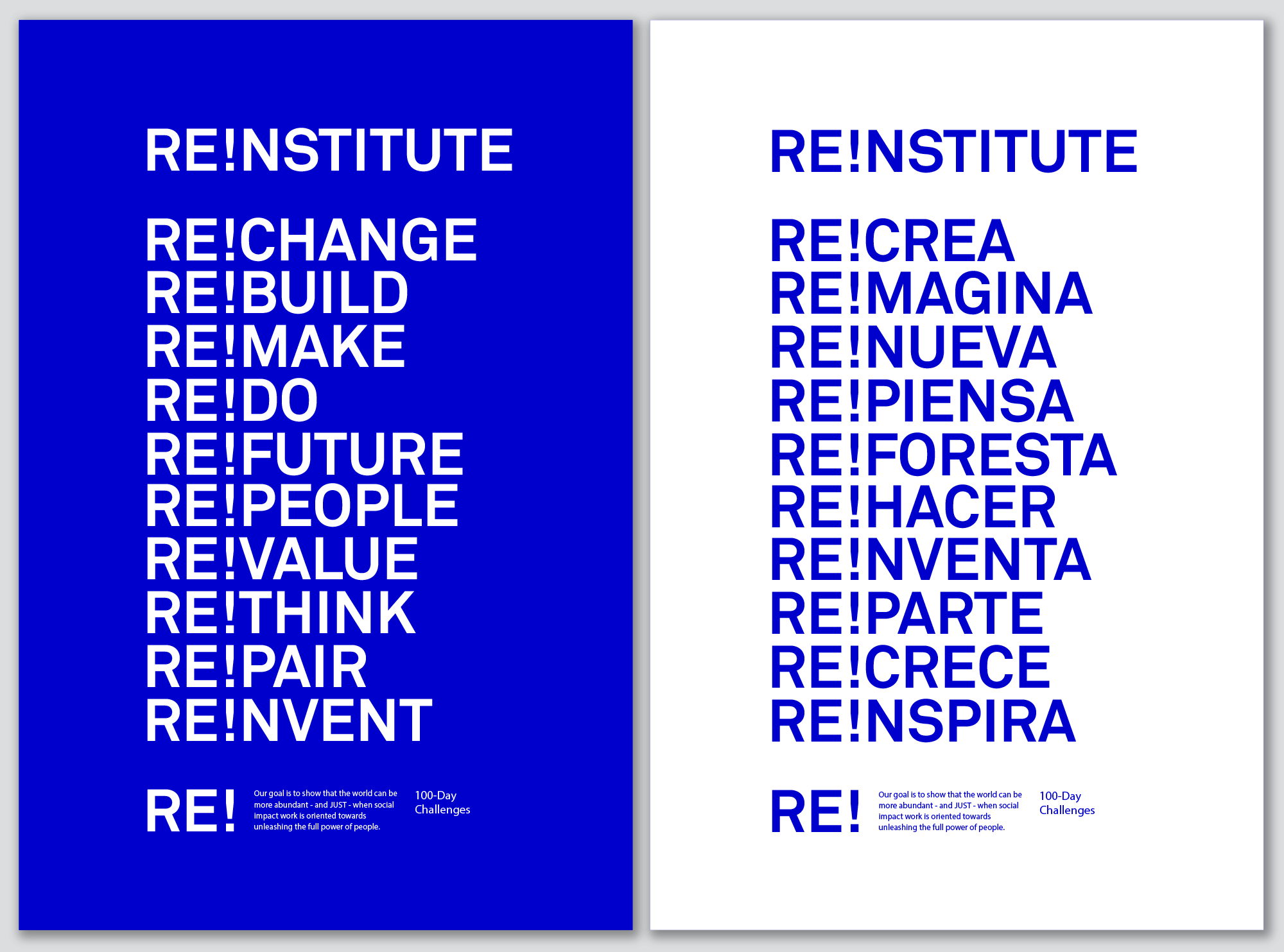
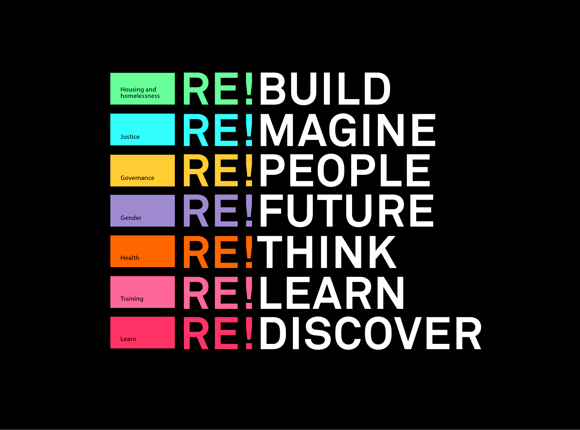
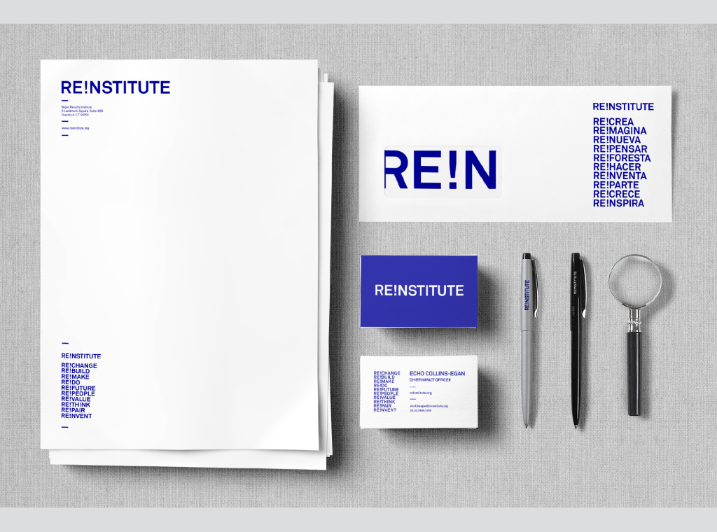
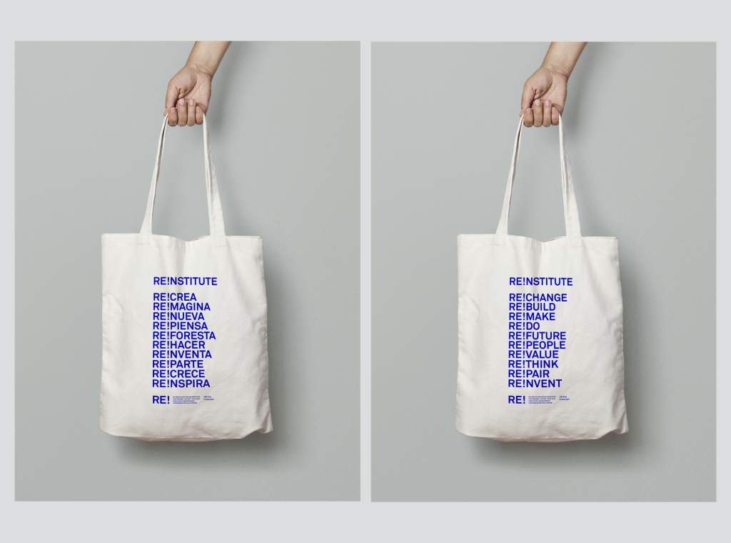
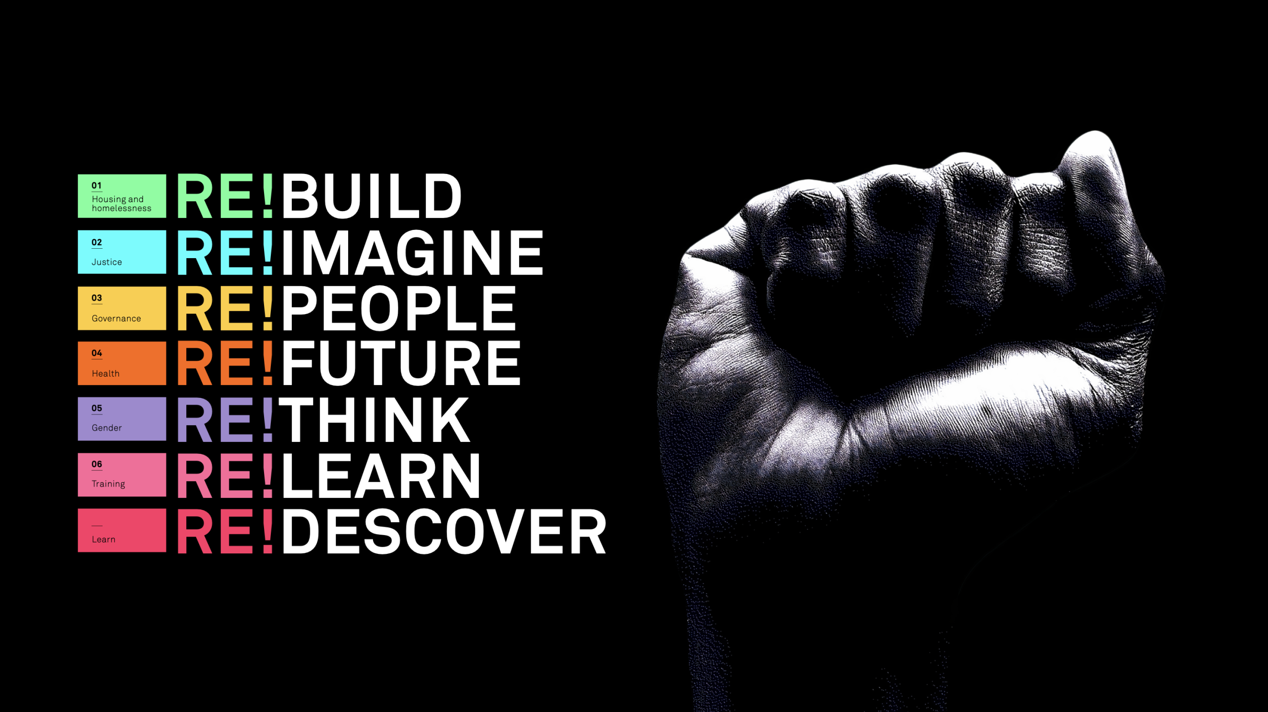
We built the entire identity around the prefix ‘RE!’: a flexible verbal and visual system capable of adapting to different sectors and geographies. From ‘Re!Imagine Justice’ to ‘Re!Build Housing,’ this naming logic offered consistency without sacrificing creativity.

During the collaborative process with the team, we discovered that its strength lay in simplicity: a single prefix that spoke all the languages of change. The transformative capacity we had identified could be expressed in any context while maintaining immediate recognition.

02.

Colour with Purpose

Instead of limiting the brand to a single colour palette, we developed a modular colour system where each shade represented a different operational branch. Health, gender, justice: each area had its own colour code.

The system made it possible to highlight the diversity of the work without losing cohesion. More than an aesthetic choice, it was a strategic decision that reflected the organisation’s values of adaptability and contextual responsiveness.

RE!NSTITUTE - 2

03.

Typography as Identity

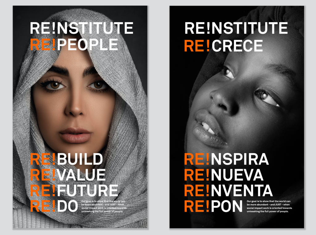
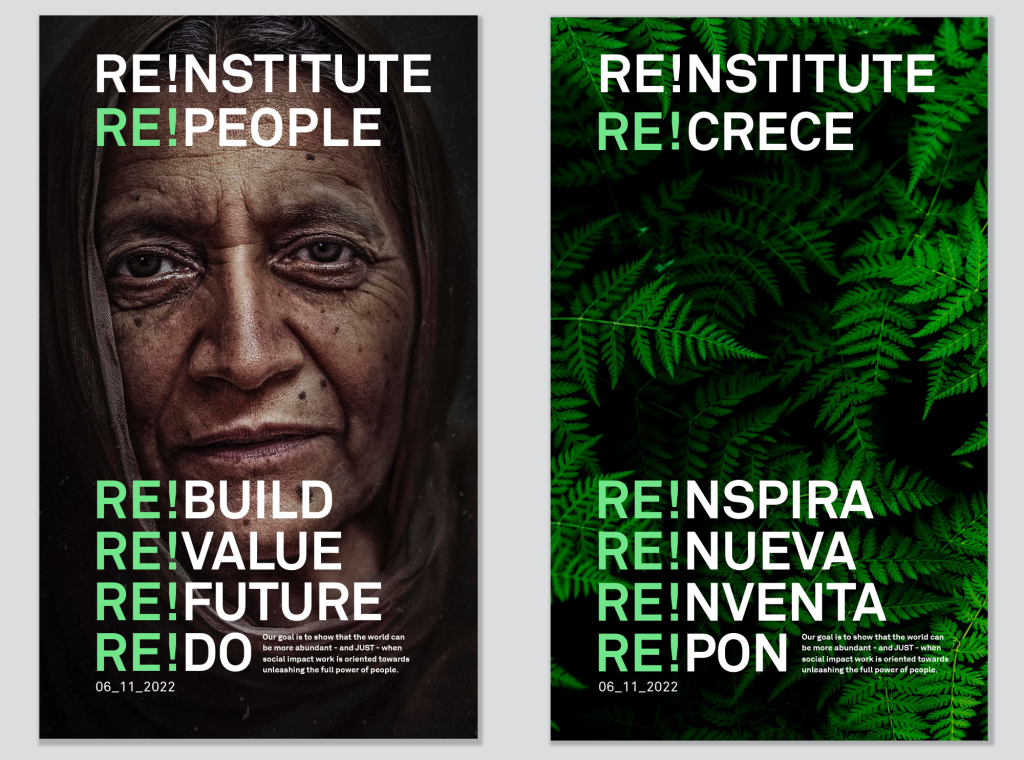
The backbone of the system was typography. We used Akkurat Pro—a bold sans-serif font—to give the design clarity and confidence, while the dynamic application of ‘RE!’ generated immediate recognition.

Each typographic choice reinforced the organisation’s commitment to clarity and direct communication. Addressing global structural problems requires that there be no room for ambiguity.

RE!NSTITUTE - 3
RE!NSTITUTE - 4

04.

Digital Ecosystem for Growth

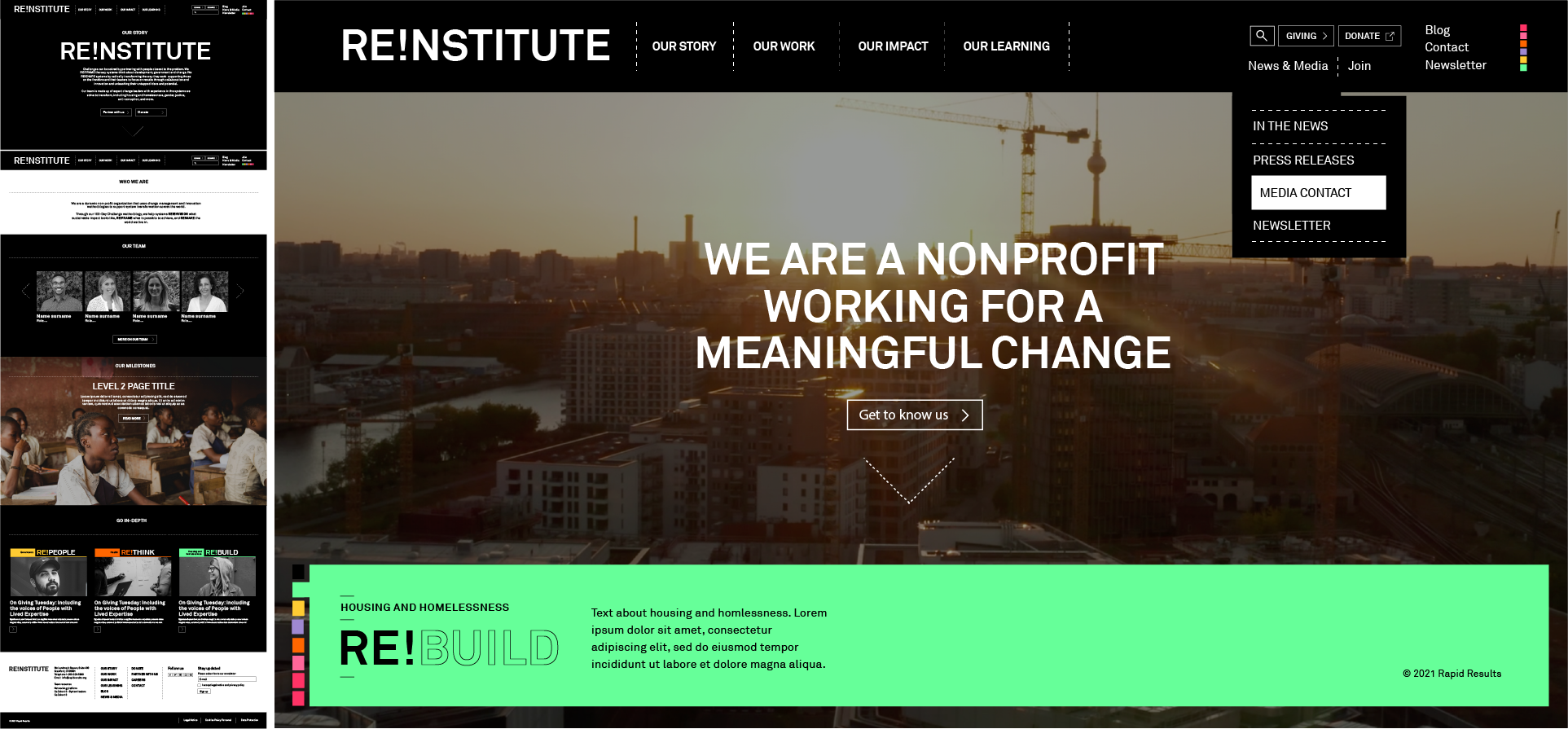
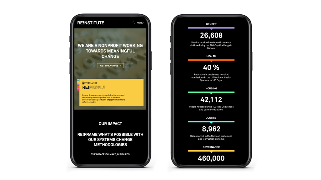
Working in coordination between the United States, Barcelona, and Mexico, we designed and developed a multilingual website designed for modular content and long-term scalability. Digital Bakers was responsible for creating the entire digital ecosystem that translated RE!NSTITUTE’s mission, methodology, and impact into accessible content.

Through this simplified ecosystem, we connected with potential allies on six continents, reflecting the global reach of a multinational organisation based in the United States but with worldwide impact.

RE!NSTITUTE - 5

SOLUTION

The new RE!NSTITUTE brand delivered a comprehensive identity system and digital ecosystem rooted in clarity, adaptability, and bold design. The prefix ‘RE!’ became the common thread throughout all communications, allowing messages to be connected across multiple sectors without losing recognition.

The website reinforced this identity with accessible, multilingual content, while the colour system offered differentiation without fragmentation. The international coordination of the team enriched the project with multicultural perspectives on global social impact.

From the first co-creation sessions to the final execution, the collaboration transformed RE!NSTITUTE: from an organisation that explained what it used to be, to an active agent of change that clearly communicates its transformative capacity in the field of global social impact.

RE!NSTITUTE - 6
RE!NSTITUTE - 7
RE!NSTITUTE - 8
RE!NSTITUTE - 9
RE!NSTITUTE - 10

IMPACT

+ 0 Countries impacted
+ 0 Justice innovations in Latin America
+ 0 Homeless people housed in the U.S.
+ 0 Million people reached
+ 0 Cases solved in the Mexican justice system
+ 0 Cars removed in UAE equivalent CO₂ impact
+ 0 Gender violence ambassadors trained in South Africa

CREDITS

STRATEGY & CREATIVE DIRECTION
Gorka Meneses

COPYWRITING & FACILITATION
Luis Sosa

VISUAL DESIGN
Fernanda Lhez
Malcolm Llanas

WEBSITE DEVELOPMENT
Julio Prieto

CLIENT LEAD
Sean Whitten, Chief Executive Officer
Echo Collins-Egan, Chief Impact Officer

UNCODE.NETWORK
Boo Design Studio
Digital Bakers
SPORE

Let's start a conversation.

Ready to work together?