
CONTEXT

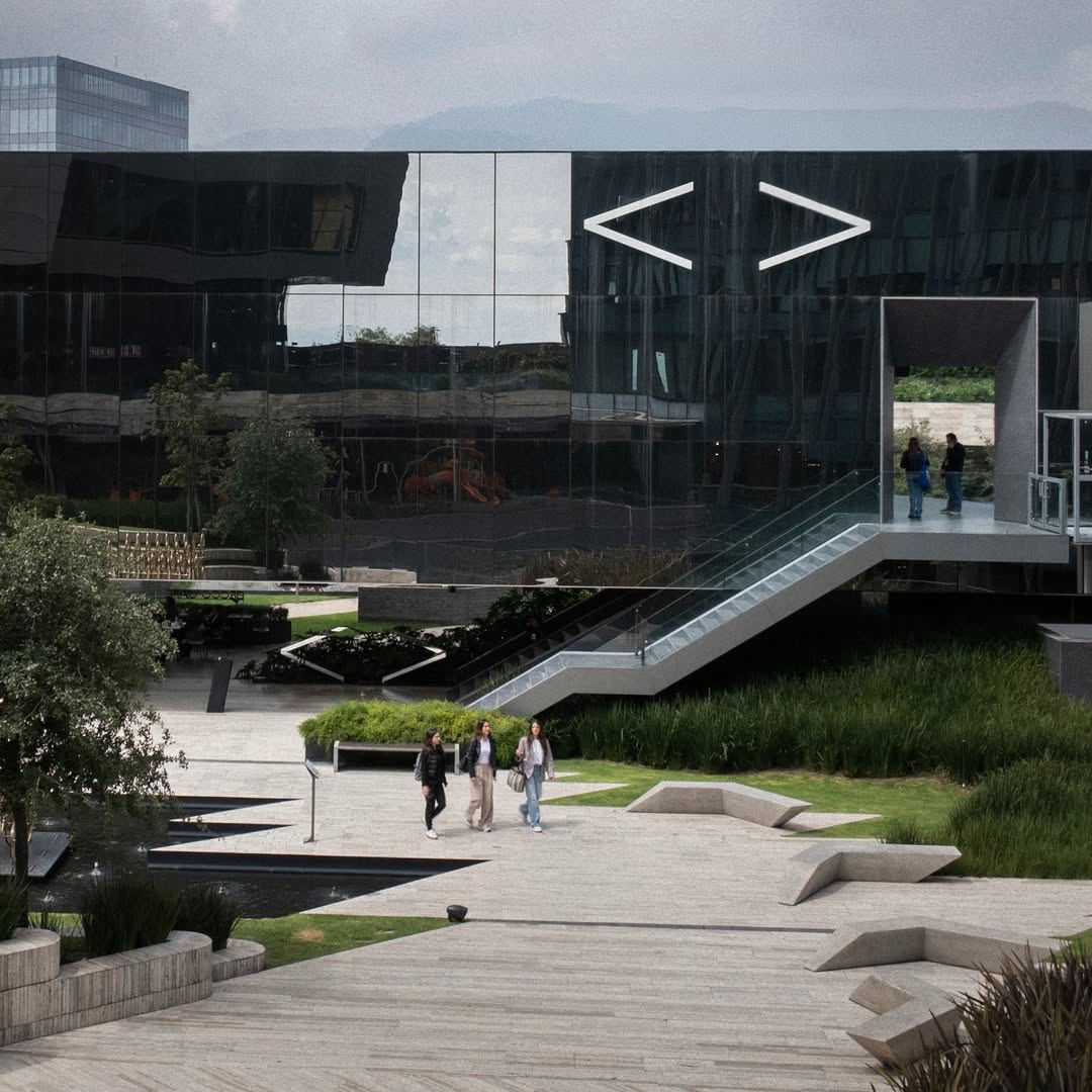
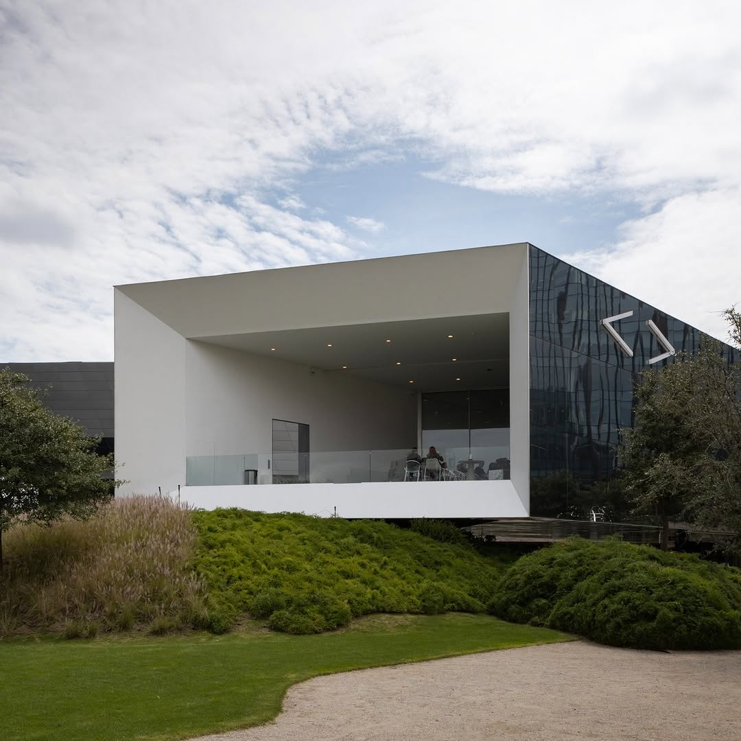
SOMA approached us with a proposal that intrigued us. The reinvention of Grupo Sordo Madaleno sought to establish a new type of cultural foundation within the Artz Pedregal shopping complex in Mexico City.

We liked their goal: not only to create a space for contemporary art, but to make it accessible, visible, and part of public life for audiences who might never set foot in a traditional gallery.

In our co-creation sessions with the SOMA team, we worked to promote a precious opportunity: to democratise access to contemporary art, which is almost always offered to a small group of society, in closed spaces, and is something foreign to most people. By taking it out of museums and galleries, it loses its distance and becomes accessible. SOMA hired us to name, position and visually construct this new institution from scratch.

SERVICES

Strategy
Branding
Digital
Experience Design

INDUSTRIES

Education
Social Impact
Culture

“Working with UNCODE Network in developing the visual identity for Arte Abierto was a deeply enriching experience. From the beginning, they demonstrated a keen understanding of the project’s spirit and a visual sensitivity that resulted in a strong, contemporary identity aligned with our values. Their collaborative approach, attention to detail, and ability to translate complex ideas into powerful visual solutions were key to creating an image that resonates with our audience. Without a doubt, their creativity and professionalism made a significant difference in the final outcome.”

— Guadalupe Salcedo, Communications Lead of Arte Abierto

CHALLENGE

How do you make contemporary art feel at home in a shopping mall?

The brief presented us with a powerful challenge. The project needed a brand identity that would stand firm in a commercial environment while projecting intellectual and artistic depth. But the real challenge was deeper: to break down the invisible barriers that make contemporary art feel exclusive and intimidating. To make it attractive and spark curiosity in an environment saturated with commercial offers, advertisements, and graphic impacts.

During our collaborative process, we worked on some key issues: contemporary art is both a luxury item and a cultural artefact. How do you invite everyday buyers into a conversation with contemporary art when most see it as something reserved for an economic or intellectual elite?

That’s when we understood the essence of our work: to create a graphic system that would integrate diverse artistic content, work across multiple media, and stand out, all without overshadowing the art itself or alienating the people it sought to reach. An opportunity to merge two seemingly diverse but actually closely related worlds.

Arte Abierto - 1

01.

Creating a System, Not Just a Logo

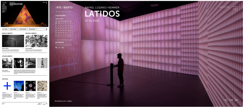
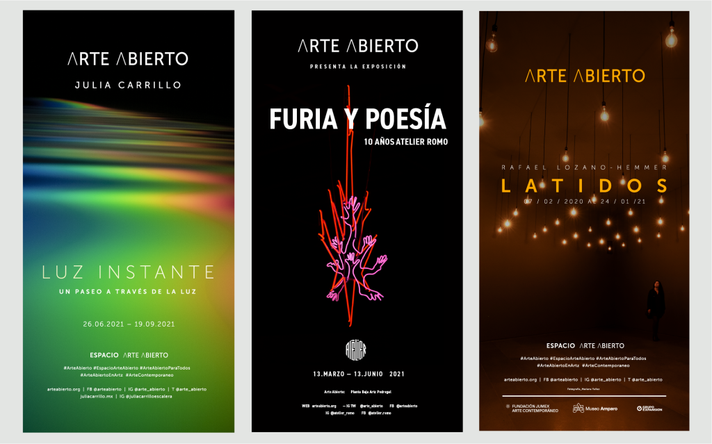
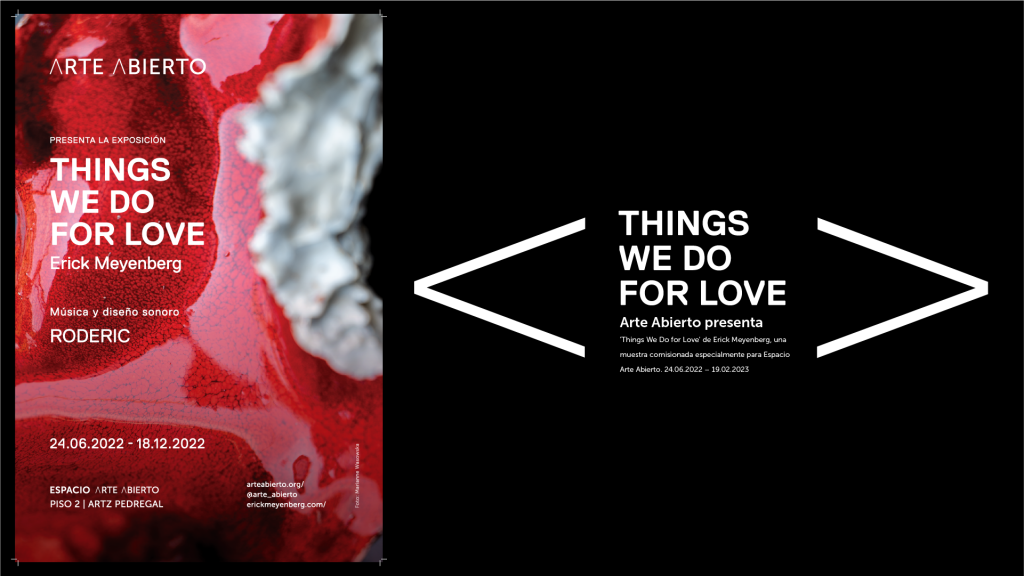
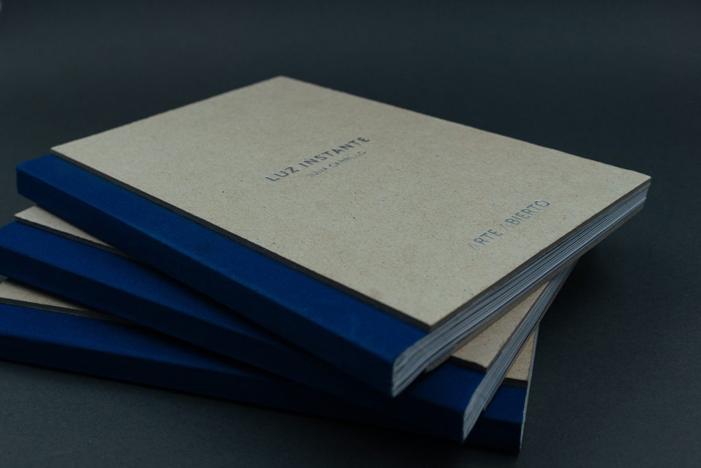
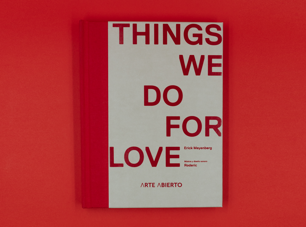
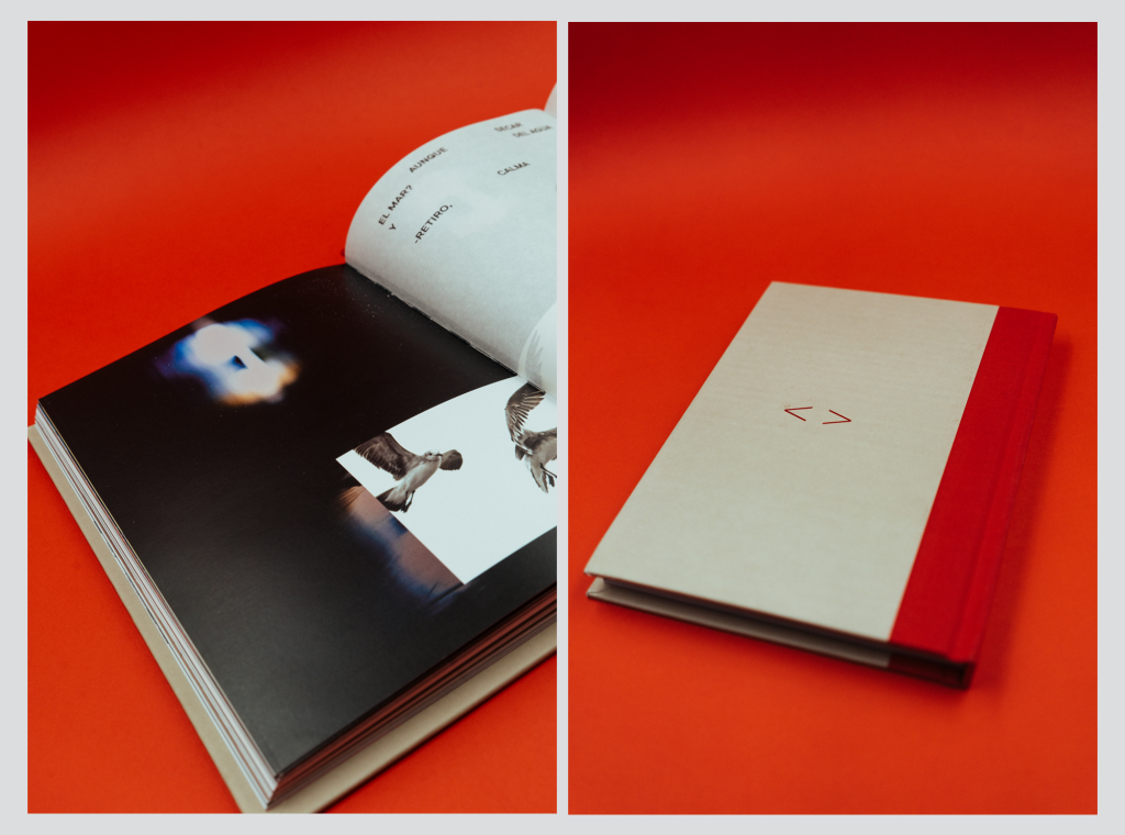
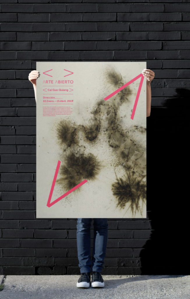
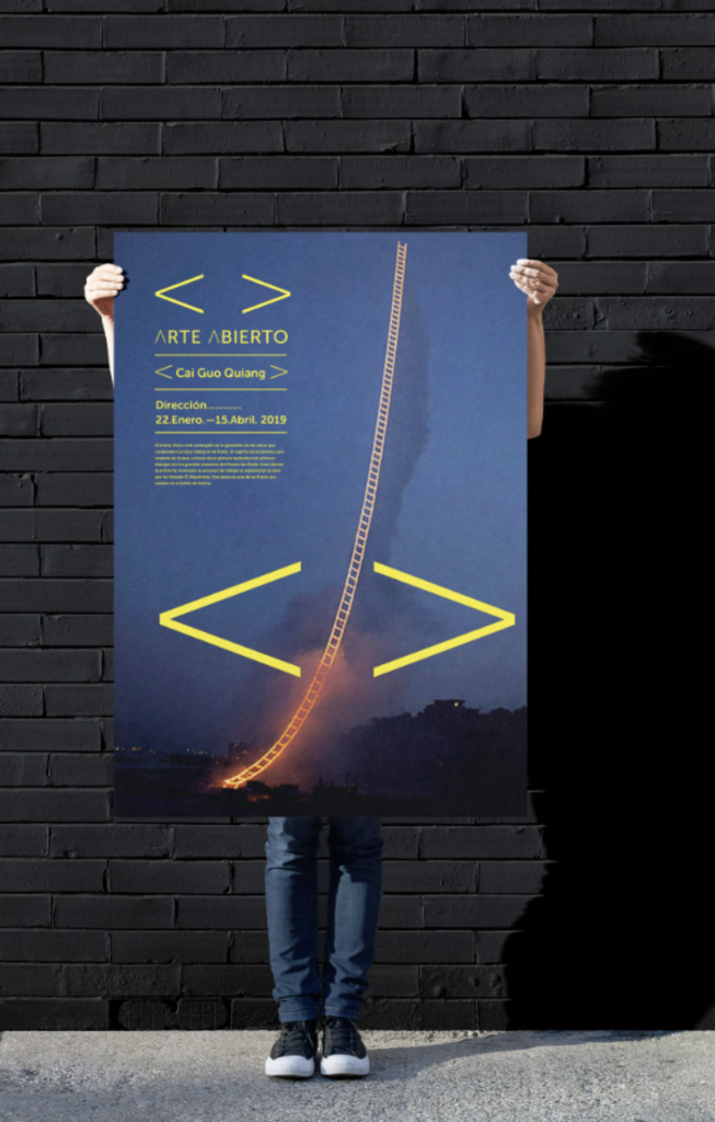
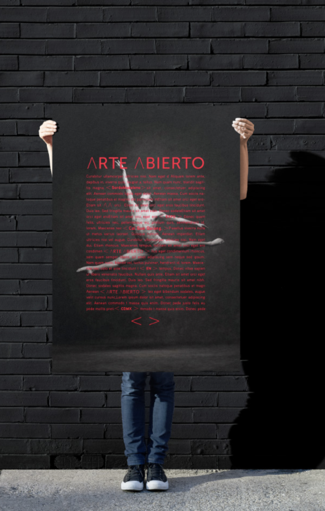
We built Arte Abierto’s identity around a comprehensive visual system, not just a single logo with applications. We designed it to adapt across contexts and formats, from wall graphics and exhibition posters to books, merchandise, and social media.

The systemic approach allows the identity to evolve organically with the foundation while maintaining consistency across all touchpoints. Always coherent, never static.

02.

Embracing Artistic Distinction

If the first impression was appealing but slightly uncomfortable, we were on the right track. We don’t aim to please or sell; we want to spark curiosity in a shopping centre, probably the most saturated environment for offers possible.

Our key decision was to completely avoid commercial or advertising language in the visual identity. The identity needed to differentiate itself from commercial environments through authenticity, not volume: we sought to stand out without shouting, to attract the eye without using advertising tricks.

We adopted a simple graphic element that could be varied, adapted and changed while becoming an iconic element of the brand, recognisable and direct.

Arte Abierto - 2

03.

Integration of Artistic Content

From the outset, we knew that identity had to coexist with the works of art. This meant creating visual structures that could integrate these works of art into communication materials without competing with them.

But coexistence was not enough; we needed accessibility. The system had to make information about each artist, artwork, and creative intention highly readable for visitors to the shopping centre who might never have set foot in a contemporary art gallery.

Our goal became a delicate balance: maintaining the democratising mission, creating a distinctive brand language, and respecting the diversity of the artworks, ensuring that the identity supported rather than overwhelmed the art it was meant to showcase.

Arte Abierto - 3

04.

Dialogue as Central Concept

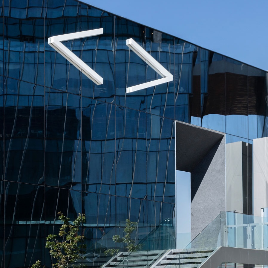
We let the concept of dialogue guide everything from the foundation’s name to its typographical choices. During the naming process, we tried out several concepts and, together with SOMA, chose two that we developed graphically. Arte Abierto not only clearly explains the brand’s purpose, but also has a graphic rhythm with the two capital A’s that we replicate throughout the visual language.

Using French quotation marks (‘ ’), the brand framed words, themes, and even works of art as invitations to conversation. The double ‘A’ in Arte Abierto, horizontalised, became a symbol of this dialogue, transforming language into a space for exchange.

The SOMA team immediately adopted the concept: art establishes a dialogue with space and with the public in the Arte Abierto initiative. Each element contained within these quotation marks became an invitation to participate in conversation about the enclosed themes.

Arte Abierto - 4

SOLUTION

Our solution for Arte Abierto connects contemporary art and commercial public spaces, dismantling the barriers that separate them. The brand uses typographic elements and modular design to express openness and dialogue, creating a hierarchy of information that makes each work of art and artist accessible.

More than a visual identity, the brand orchestrates a dialogue between artist, artwork and audience, positioning these elements as sender, message and receiver. It visually frames art and conversation without competing with them, offering a dynamic yet minimal setting for artists and audiences to meet.

By striking a balance between democratisation, distinction and respect, we demonstrate that contemporary art can find its home in unexpected places, amplifying culture while making it inclusive. A cultural and social impact that brings art closer to a wider audience in an unusual commercial environment.

Arte Abierto - 5
Arte Abierto - 6
Arte Abierto - 7
Arte Abierto - 8
Arte Abierto - 9
Arte Abierto - 10
Arte Abierto - 11
Arte Abierto - 12
Arte Abierto - 13
Arte Abierto - 14
Arte Abierto - 15
Arte Abierto - 16

IMPACT

+ 0 Commissioned exhibitions
+ 0 Art installations
+ 0 Exhibition and installation visitors
+ 0 Public programme activities
+ 0 Participants of the public programme activities
+ 0 Publications

CREDITS

STRATEGY & CREATIVE DIRECTION
Gorka Meneses

VISUAL DESIGN
Fernanda Lhez
Malcolm Llanas

CLIENT LEAD
Mónica de Haro, General Manager
Guadalupe Salcedo, Communications Coordinator
Roberto Velázquez, Planning and Operations Director

UNCODE.NETWORK
Boo Design Studio
SPORE

Let's start a conversation.

Ready to work together?